Instead of building on its existing design language and setting itself apart, Samsung decided to put a swarm of flies in the proverbial ointment, giving its latest hardware event a particularly sour aftertaste that will take too long to wash out.
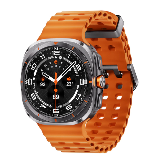
I, for one, won’t be able to take at the Galaxy Watch Ultra seriously, even though it will likely be a good device. Just looking at it fills me with negative feelings about its lack of originality; if I wanted an Apple Watch Ultra, I’d get an Apple Watch Ultra, not this Androidified imitation.
Two peas in a pod, but not the way you think
You can’t tell me they don’t look the same
- The squircle case with the raised bezel on the right (although it employs a circular display, the general shape of the Galaxy Watch Ultra is extremely similar to the Apple Watch Ultra 1 and 2);
- The customizable Quick Button (in International Orange color, nonetheless) is similar to the Action Button of the Apple Watch Ultra;
- The Marine Band is nearly a carbon copy of the Apple Watch Ultra’s Ocean Band, including the name;
- The Trail Band is nearly a carbon copy of the Apple Watch Ultra’s Trail Loop, including the name;
- The automatic Night mode on the Galaxy Watch Ultra is a carbon copy of the automatic Night Mode on the Apple Watch Ultra 1/2;
- There’s an 86dB siren on the Galaxy Watch Ultra, there’s also an 86dB siren on the Apple Watch Ultra 1/2;
- Double Pinch gesture is a carbon copy of the Double Tap feature on Apple Watch Ultra 2/Apple Watch Series 9
It’s not only Apple that has been the target of Samsung’s homage, though. The new AI-powered Energy Score features takes a homage from Garmin’s Body Battery metric, for example.
Why did Samsung abandon all of its design advances and went on a homage spree, taking not only a single page but nearly a whole book of Apple’s design language?
Is Samsung admitting design defeat?
At this point in the article, you’d probably expect me, the author, to draw something out of my proverbial pocket and reveal the real reason why the Galaxy Watch Ultra looks so identical to the Apple Watch Ultra. Sadly, I’ll disappoint––my guess is 100% as good as yours, and I can only guess.
Even though I’d love to know the real reason why Samsung has (once again) gone down the path of imitation, it’s certain that it had some good reasons to do so. We are talking about a truly massive company, a major conglomerate, which took a profound look into its own past products and still decided to imitate its main competitor in a very blatant and obvious way.
Could it be low sales numbers?
Could it be hope that the new device would cause some customer confusion and could sway away potential adopters of the Apple Watch Ultra to go with the Samsung smartwatch instead?


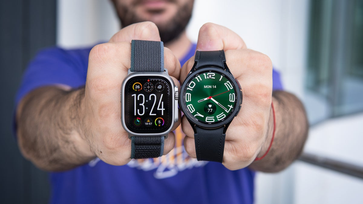
Apple Watch Ultra 2 vs Galaxy Watch 6 Classic 47mm (Image by PhoneArena)
This one surely sounds the most plausible to me. Despite the timeless appeal of circular smartwatches, these are a nostalgic remnant of the classic mechanical timepieces, which don’t make a very efficient use of the internal space.
The Apple Watch Ultra, for example, with its mostly rectangular and squircle shape, can fit a larger battery inside in comparison with a circular smartwatch of the same size. As you can see below, the Watch Ultra 49mm houses a 564mAh cell, while the larger Galaxy Watch 6 Classic 47mm can only fit a 425mAh. With smartwatches, every little bit helps, so a crucial difference.
Some of you may point out that the circular Galaxy Watch 5 Pro, for example, had a larger 590mAh battery in comparison with, say, the first-gen Apple Watch Ultra (which had a 542mAh battery). That’s true, but it was also a thicker and heavier smartwatch, so still not the most efficient when it comes to space usage.
Don’t think I’m trying to exonerate Apple here: Cupertino is also no stranger to borrowing features and design cues.
Just take the most recent iOS updates as the prime example of Apple inspiring itself from features and functionalities that have been available on Android for ages. Widgets, lock screen and icon customization, heck, even free-form app icon placement were on Android first.
Personally, I’d love it if Samsung relied on its in-house designs more instead of going out of its way to copy Apple. Seems to me such practices are better left in the days of old, in the early 2010s, when every company was trying to find its shtick and come up with a unique design language. Although not a particularly big fan of Samsung, I fondly remember well-designed phones like the iconic Galaxy S8, which was among Samsung’s best-designed ones.
Here’s to hoping in-house creativity will prevail.
👇Follow more 👇
👉 bdphone.com
👉 ultraactivation.com
👉 trainingreferral.com
👉 shaplafood.com
👉 bangladeshi.help
👉 www.forexdhaka.com
👉 uncommunication.com
👉 ultra-sim.com
👉 forexdhaka.com
👉 ultrafxfund.com

